Sunday, February 22, 2015

Setting Up Home: Styling Shelves


Wow, this post has been a long time coming. 

I don't know about you all, but I have a million "pretty things" that NEED to be displayed! ;) So many thrift store treasures! Lol

Keep on mind, this is not a bookshelf post but simple decor shelf ideas. However, you can incorporate a few of these ideas into your bookshelf, if you are inspired to! 

Lately, I have been hesitant to blog because I would never want anyone to feel discontent or overwhelmed about their home, because of these ideas. My main goal is only to share my love of decorating with you and maybe to inspire you; never overwhelm you. 

With that said: here is how I decorate my shelves to showcase my favorite pieces! 


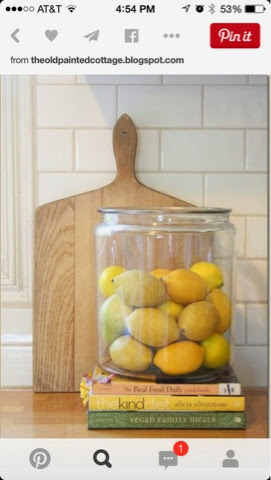
First I start with any books that I want on my shelves. I find it more interesting to lay them in different directions. You can even turn their spines towards the back for a more neutral look. But I love color so I leave the spines out! 

Next I add any big pieces of art. These larger pieces add height and interest to the vignettes. (Vignettes= grouping junk together) ;) 

And you all know I prefer to group my junk together in either 3s or 5s! Odd numbered vignettes are more pleasing to the eye! 


After the art, I add items on top of or next to my book stacks. 


Then I take any large decor pieces that I have and layer them in front of the art. This adds depth and textural interest to your vignette. 

 
And the last thing I do is add in smaller items in front of the books and next to the large items. Because more is always best! ;) 

You can easily do this with one shelf or many. You can also use these items to style a tabletop. 

Now go hide all the books in the closet and pull out the pretty stuff! Kidding kidding! 

There are Gorgeous ideas on Pinterest for styling bookshelves, if you are interested in that also! 

Happy Sunday! 

Friday, January 30, 2015

Setting Up Home: Hanging Curtains and Styling Bookshelves

This series has been really fun to do and I hope, so far, it's been fun and inspiring for you. 

For this post, I'm just going to give you some quick tips for hanging curtains and styling shelves. 

First up: Curtains! 
How hard can it be to hang curtains?! Right? Before I started reading decor blogs, it never crossed my mind there might be an art to hanging curtains. 

The first and most important tip is to hang your curtains 
HIGH 
and WIDE 
Here are some pictures of what I mean...

I use to think the "don't" was how to do it. It seems logical to hang the rod right above the window and at the same length as the window casing. However, you can clearly tell which one looks better here! 

Just like our eyes, we want our windows wide and bright! Not looking like they are lost in the wrinkly folds of our skin... ;) 


So higher and wider is better! But what about LENGTH!! This is the one that will make the MOST difference, in my opinion anyway. ;) 

Let's look at some sad sad curtains. 

If your curtains look like this last picture... I'm not sure this blog can help you.... Yes, it can! Burn them now! 

Moving on, the former picture shows decent enough curtains, but they are really hung too high off the floor. Just like your pants, no one likes high watered pants! 

Often you will run into the problem of having to chose between hanging them high and sacrificing the floor portion or hanging them low and sacrificing the top of the rod. This is really common when buying standard curtains at the store. Most only come in 84" length, which I'll tell you now, is probably NOT going to allow you to have them float just above the floor and be hung high above the window casing.  

I always look for curtains at least in the 90" area and I ALWAYS measure at least 4" above my rod and down to the floor, so I can get a general idea of the length I need. 


These curtains are beautifully done. They could even be an inch closer to floor, I think. I would probably push them further out from the window too, so more light comes in. But overall, they look well tailored and nicely done. 

One trick I use, because I am cheap (as if you didn't know that), I buy nice king sized flat sheets, with a little sheen, cut them in half and hang w drapery rods. King sized usually gives me the 90" or so in length that I need. Otherwise, you'll probably have to buy them online! 

Ok! Happy curtain hunting and when you can't find the length you need, don't blame me! ;) 

Bookshelves: update: I was going to do bookshelves in this post, but realized doing an evolution of them would be more helpful, so you could see the different stages of styling them. I will do this post next week. 

For now here is a sneak peek and be sure to read Decoating to the Power of 3 post before next week! 


Happy Friday!! 


Tuesday, January 27, 2015

An Entry Way When You Have No Entry Way

So yesterday, I wrote about how to create an entry way and a lot of the comments were saying "but we don't have any entry way" or "we don't use our front door!" 

If you have even a tiny wall space by your door, you can still address a lot of the concerns, I wrote about yesterday. 

So here are a few pictures for creating an "entry way" where none exists. 

Here is our back door/ garage door, that we use daily. It quickly became evident that I was going to need to add some kind of organization back here! 
I added 2 small thrifted hooks for keys , bags, and jackets. I added the small step stool so the boys could take off their shoes. I could even add a wall basket for wallets. 

This wall is very well done also and gorgeous to look at! If y'all don't follow house tweaking dot com, you should! Welcome to your new time suck ;) 

She simply added a shelf with hooks and a small bench! Beautiful and useful! 

Ok, in our last house, I didn't even have a smidge of wall space by the front door. It was completely overtaken by the door and 2 windows! But I did have the stair landing! 

This picture is from the joyfolie blog and it's pretty blurry, but you can see how she added hooks at the landing. This is SUCH a great way to use a landing, that's next to the door! 

I would have added a mirror and basket also, on the wall! 

Note: I made sure to hang my hooks low enough that the littles could reach them too! Why make more work for yourself! 


Be sure to link up pictures of your space over on www.facebook.com/creationsbyrachel or on IG hashtag #cbrblog
I would love to see what you all are working on! 

Monday, January 26, 2015

Setting Up Home: Evolution of an Entry Way

You know what they say about first impressions: they either make ya or break ya! The entry way, where you welcome friends and family, is the first impression of your home. 

Not only does it the set the tone for your whole house, I believe it sets YOUR mood, as soon as you walk in the door. 

Is there a place for your keys, coat, wallet or purse? Is there a place for the little ones to take off shoes and put school bags? These are a few of the things I asked myself when setting up our entry way. 

Let's get started! 

First: I started with my basic pieces: a bench for taking off shoes and a mirror. It looks okay.... But definitely boring and basic. (I even swept for these pictures ;))

The next thing I wanted to do was to focus on adding some rugs to catch mud and dirt as soon as we walked in. I also wanted to soften the bench a little, so I added a few pillows. 
It's starting to look a little more like a house now. But still too boring and still nowhere for shoes or keys. 
So I added a basket to corral all of our shoes. 

Next I focused on creating a place for guests to leave purses or keys. I added a small table with a wire basket and a decorative hook for purses, book bags or small jackets. (A pretty plant never hurt either) (it's ridiculous how happy that pig makes me!) 
So now I have addressed most of the organization problems ( believe me, you'll be glad you added a spot for keys and wallets, when your husband stops asking you where they are!!!) 

Last but definitely not least, I focused on art! 
I accessorize the small table, because let's face it, I have a LOT of thrift store crap that definitely deserves to be front and center! ;) Then I added a small gallery wall, making sure they were hung at eye level and down towards the table. I love adding wreaths to mirrors. They help break up the large emptiness of big mirrors. 
I quite like my entry way now! It makes me happy everytime I come home! 
Again the before and after: 
Before

After! 
Thanks for reading and now get busy! 


Friday, January 16, 2015

Fun wall ideas even Renter's will LOVE


I decided to take a night off from the Setting Up Home series (if you can call it that). I really wasn't inspired to talk about rug sizes or hanging curtains; although, I do plan to get to those topics soon. 

I wanted to share with you some FUN ideas for bringing some pop, snap, and zazzle (totally not a word) to your walls and RENTERS you will love this idea too. 

For 10 years, we rented and I was always searching for ways to bring some, my word of choice, pop, to my walls. I always met with frustration at the costs of removable wallpaper, and was far to lazy to paint, only to have to REpaint in a few years. 

But a few nights ago inspiration struck, and it cost me less than $20 bucks! 
It came in the answer of repositional and completely removable vinyl stickers. 

Prepare to be amazed! These walls are FUN, and no one on your block will have a house as fun as yours ;) 

Love love love these gold dots in this bedroom! Source: the_handmade_home
Or how about this EASY black design done with black tape from Designing your small space dot com! 
I can't get enough of this giant confetti wall done by weebirdy dot com. I believe this might have been done with colored paper!

Another adorable kid's room done in gold and teal triangles from almalu's place dot com. 
Oh black triangles, I love you. I might do this in my boys' room, but I think my oldest might have his own ideas... (We don't always see eye to eye). 
Source: chasing sunshine dot com
And lastly, I used gold vinyl to make some arrows for our guest room. My picture taking skills are not the best. Sorry about the crappy picture, but it looks pretty in real-life. I guess you'll have to come stay with us to find out ;) 
Again, this took me about 10 minutes to peel and stick on the wall in a "loose" pattern, and cost about $20 in materials! 

I love all the designs: dots, triangles, arrows, stars... I can't get enough of them. (Here's a shameless plug, if you want some of these for your wall, I would be happy to customize them in my shop! Let me know! I've also seen gold dots sold at Target from time to time! )

These aren't just for bedrooms, a bathroom wall, foyer wall or even a ceiling   Would be great areas too! 

I hope this inspires you to create something unique and young at heart, in one of your rooms!


Sunday, January 11, 2015

Setting Up Home: Hanging Pictures


Hanging pictures, simple right?! It really is, and I'll give you 4 tips to make it even easier! 
I can't tell you how many times I've been in homes where the walls were blank {shutter}, or pictures were hung WAY above my head, or worst of all, random pictures were placed all over the wall with no cohesion; (the guilty shall remain nameless). 
Don't worry I found this image on google, not one of y'all's facebook pages! If you have pictures hung like this, PLEASE, for all that's good and holy, take them down immediately. Go ahead, we'll wait. 

Immediately, looking at this picture, I notice 3 things: they are all hung too high, too far apart and are too small for the space. 

So tip # 1 
When hanging a picture, a single picture, the CENTER of the picture should be hung at eye level. Now if you are say, 4' tall, ya might wanna raise it up just a bit! 
Actually, the experts say the center of the picture should be 57" from the floor. I have never measured this. I just eyeball it!
When the center is at eye level, your wall decor will have a more cohesive relationship with your furniture. Basically, the wall decor and furniture will look like one unified display. 

Gallery wall note: "on center" works for gallery walls too. Just make sure "the center" of the group is at 57". It'll work everytime, I promise! (Gallery wall "how-to" tips coming soon).

Tip #2
Pictures look best on the wall when the size of the frame is in proportion to the wall space where it's hung. 
Vs.
Don't let your art or family pictures get lost on your wall! These smaller frames look best in a gallery wall feature. 

Tip #3
Make toothpaste your best friend! Now your husband will probably think you have lost your mind but it's handy for more than just fresh breath. Dab a little on the hanger of your picture, and smoosh against wall where you want it to hang. The toothpaste will dot the wall, exactly where you need to place the nail! 


Tip #3
This is for hanging those PESKY frames with TWO hangers on each side!!! I hate those!! But if you take a piece of painter's tape, lay it across to both hangers, mark a few holes it in, remove, and place it on the wall, it'll be an instant place marker for those nails! Now, who do ya love?
(Remember to use a level or you might stop loving me.)
Use the level in the middle of your tape, once it's on the wall, to make sure the marks on each end of the tape are level to one another. 

Now, go forth, and make a bunch of holes in your walls! You won't regret it, (well you might!) ;)

Hope these tips help! 


Thursday, January 8, 2015

Decorating to the Power of 3

Have you ever looked at a magazine picture and thought to yourself, "why do ALL their knickknacks look beautiful and pulled together and mine don't!" "Why does it always look good for them but like a mess for me?!" 
It's a secret I learned when I first began devouring design blogs, and it's one I return to time and time again. The power of 3! 
Here's a few examples of how I use 3's in my decorating. 
Notice in the first picture I used 3 seperate objects: the red ginger jar, the art and the smaller glass Japanese float. Three seperate objects grouped together to make one visually interesting picture. Also in the 2nd picture, you'll notice 3's in the stack of 3 books and again the books are grouped to make 1 and then there are 2 pieces of coral, so again the 3 is repeated. 
Studies show that objects grouped in odd numbers are more pleasing to the eye than even numbers! Keep this in mind the next time you are looking at home decor mags or blogs and see if you notice this trend.  
However, JUST as important as the number is the depth and height of your objects. Take at look at these next pictures and notice how the objects are staggered and staged in 3's 
You'll notice in the suitcase picture that there are actually 6 items but your eye really sees them as 3. The suitcases repeat the 3 and then you have the group of frames, suitcases, and then the cloche. 
Go take a look at your knickknack patty wacks, uh I mean knickknacks, and try this idea out. ;)